Arcade Typography
A specific typography has influenced arcade video games, starting from the late ‘70s up to the present day: the monospaced font built on an 8x8 grid. The research presented in the thirty-two pages booklet synthesizes this aesthetic. The booklet alternates articles that narrate the evolution of this particular font family, with a special focus on milestone games in this history.
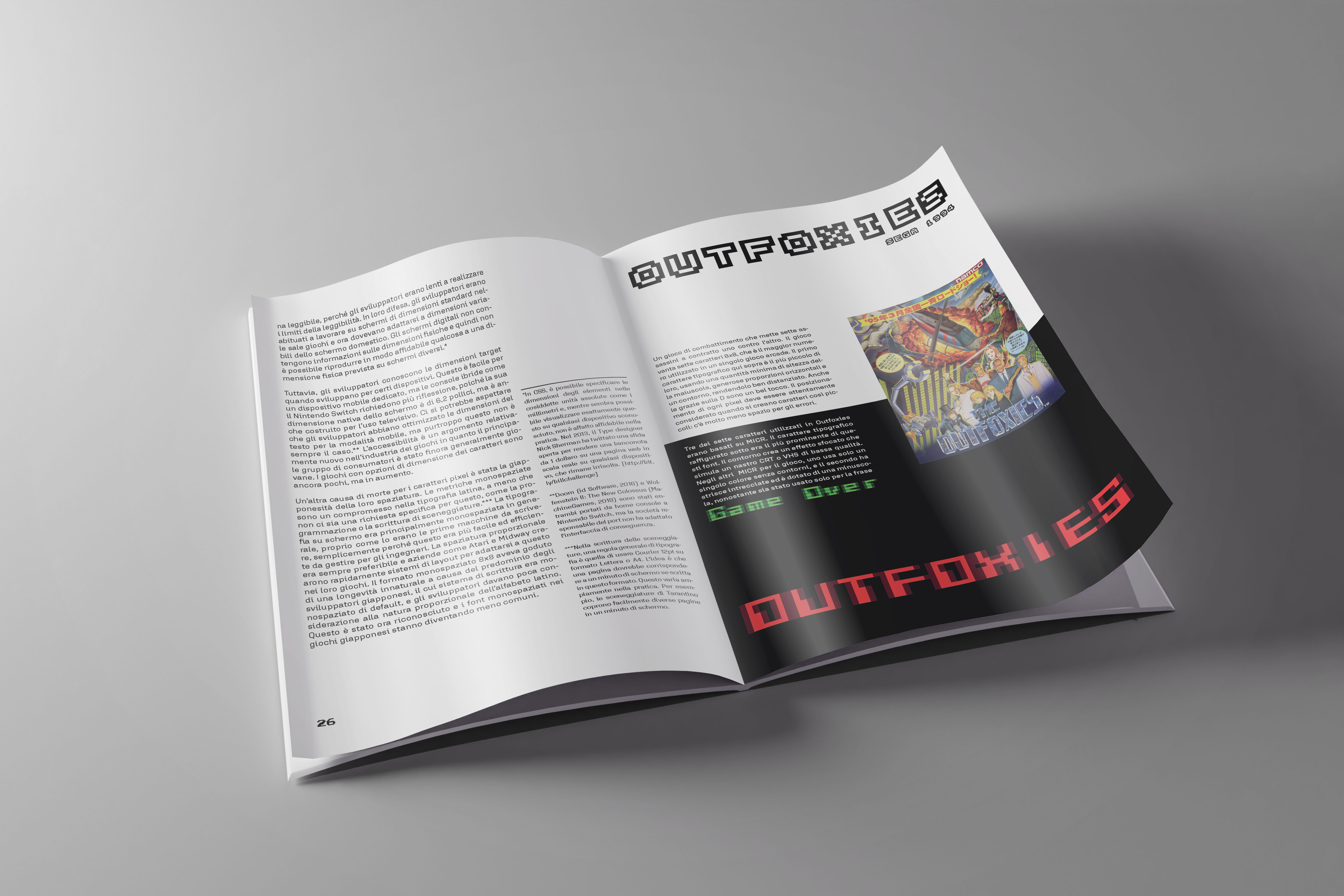
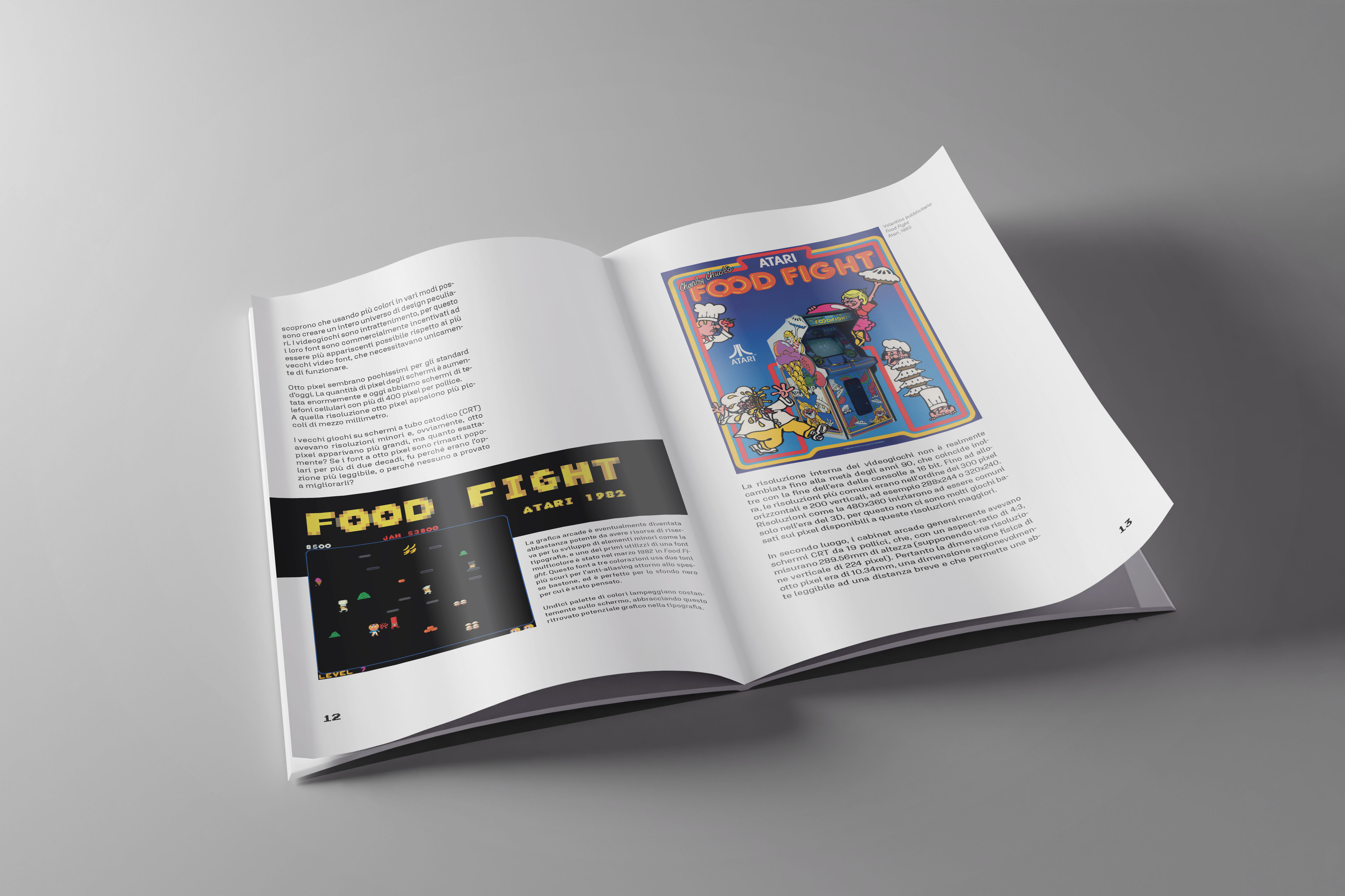
The cards display screenshots from the game, accompanied by a brief description and the game’s name in the original video game font. The cards are complemented by advertising material from that era or typographic inspirations. The fonts chosen in the project evoke those characteristic of the book’s discussion. A modified version of the classic Atari font is used for the titles, while for the body of the text, a highly readable font with square shapes is employed.